Material UI/Image Buttons for N4
- Drag n' Drop
- Links to Ord
- Material UI Styling
- Clean pristine click effect
- Easy to Configure
- Add images as buttons
The Material UI/Image Button Widget allows you to navigate to a station ord, hyperlink, or external hyperlink. When combined with our dashboard templates, your PX pages can easily navigate to other dashboard links. More info below. Before you start, copy the .jar file to your modules directory. Restart the station and Workbench.
Are you looking for a cost effective way to manage and visualize data for all your customers? Why not have a look at View Builder?
Before you start. Download the modules from our portal (see your order confirmation, which also explains licensing). Copy the modules file to your modules directory. Restart BOTH station and Workbench.
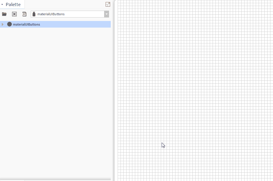
1. Copy the materialUIButtons-ux.jar file to your modules directory.
2. Open the module from your palette file.
3. Drag and drop the widget from the palette onto your px view.
The buttons have a number of configurable properties that can be used to modify look, feel, and functionality. Change the properties as required.
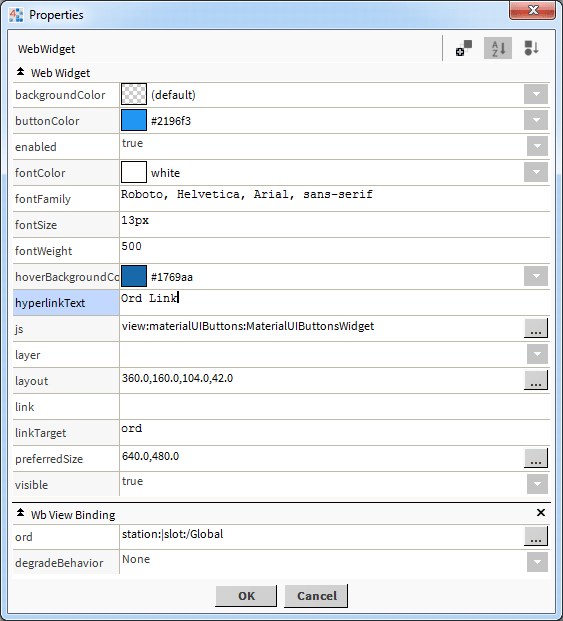
Main Ord:
The Niagara object the button points to.
Set this to an absolute ord, e.g.
station:|slot:/Drivers/
NiagaraNetwork/AHU5 or relativized ORD e.g.
slot:AHU5
OR
Be sure to set the link property above to an absolute ord e.g. station:|slot:/Drivers/Graphics/AHUs
and the linkTarget to ord
hyperlinkText:
This is the text to show for the. Clear this value if you bound the widget to an ord like the step above.
If an ord binding is set and this value is populated, the hyperlinkText value will be shown.
link:
This is the link you want the hyperlink widget to navigate to. Examples:
External Link: https://www.google.com/
Dashboard Template Link:
/ord/file:%5Etemplates/
floorplanZoningView/
Niagara44_46_47/
index.html%7Cview:web:
FileDownloadView#/
energyConsumptionView/
station:|slot:/Drivers/
Graphics/AHUs/AHU1?displayName=AHU1
NOTE: if you want to use the Ord binding link see below.
linkTarget:
Link Target is the location of the Window (e.g. new window/tab). Possible Values:
ord - if set to ord, the link will navigate you to the widget ord binding
top - URL replaces any framesets that may be loaded. This is the default. Works best when linking to a dashboard link.
blank - URL is loaded into a new window.
parent - URL is loaded into the parent frame
self - URL replaces the current page NOTE: this one is not used, but can be set if needed.
Ord Link Example:
Dashboard Example:
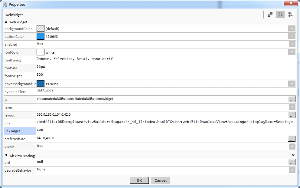
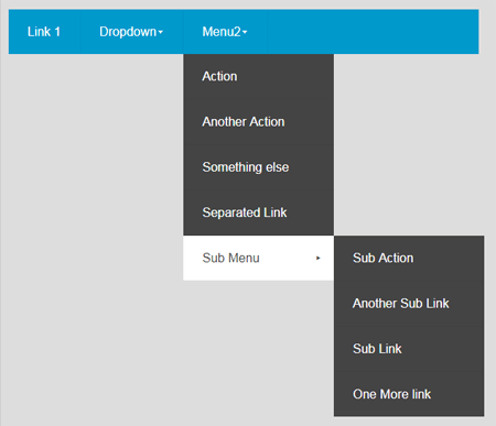
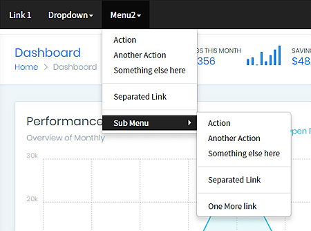
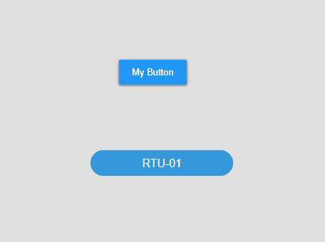
Image Button:
You can also make the button an image button. The text is shown on the button. Use the normal and mouseOver settings to specify the image to show.
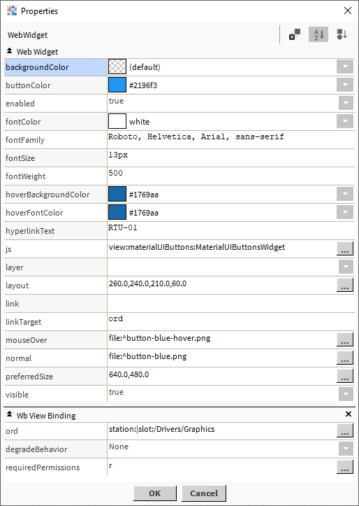
Demo:
Build Your Own dashboards and win Projects by showing data that increase value and reduces expenditure.